Max Estates
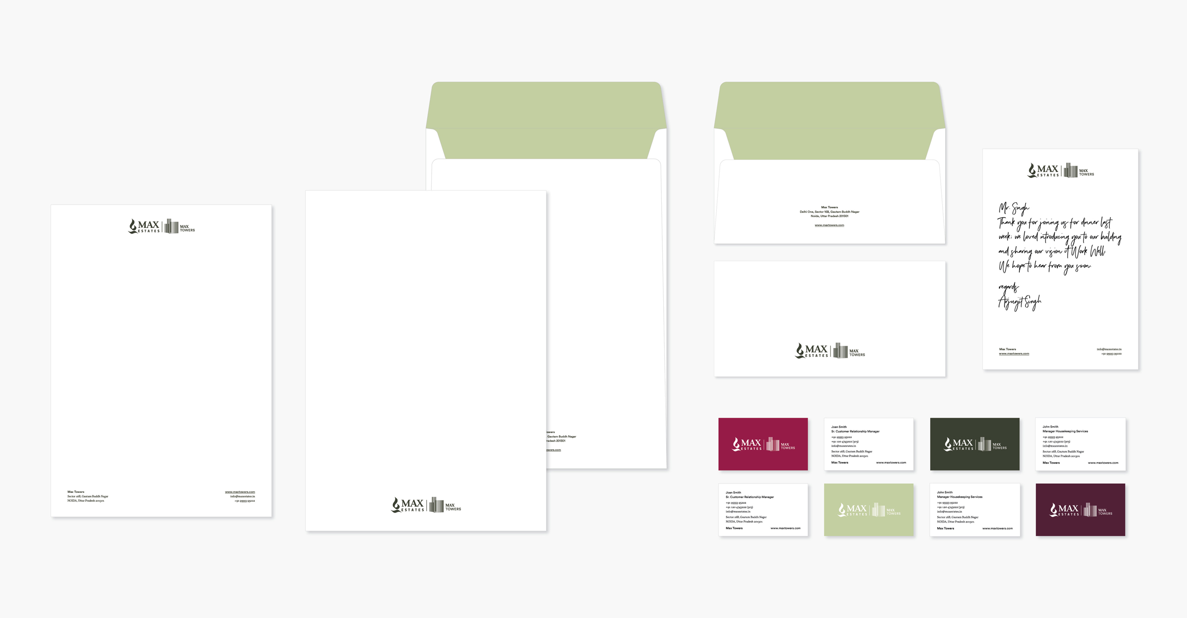
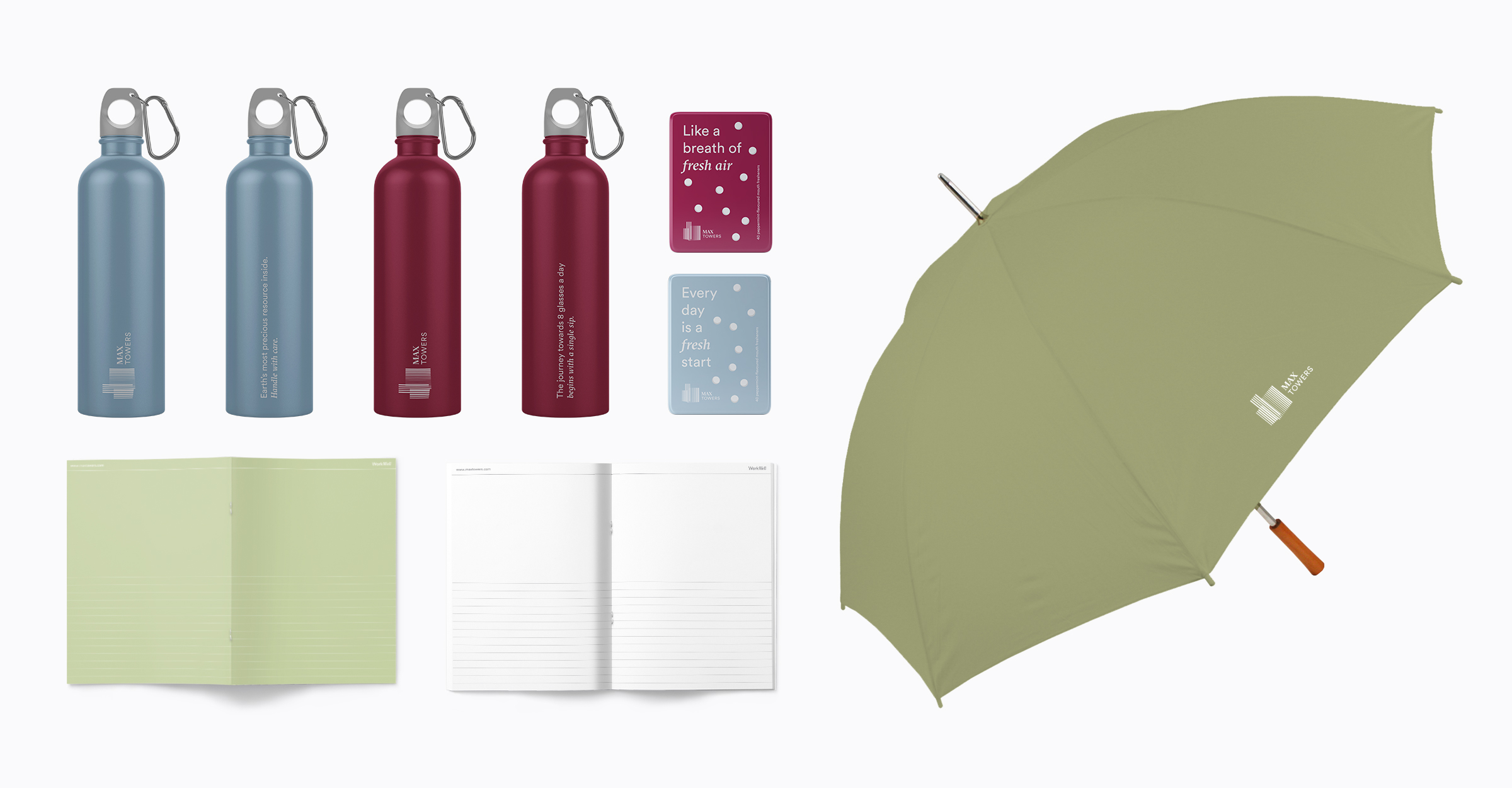
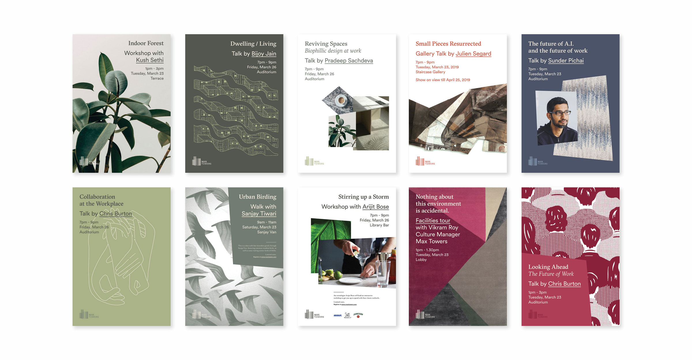
The Brewhouse worked on positioning, identity, communication, wayfinding, space and event design for Max Towers.
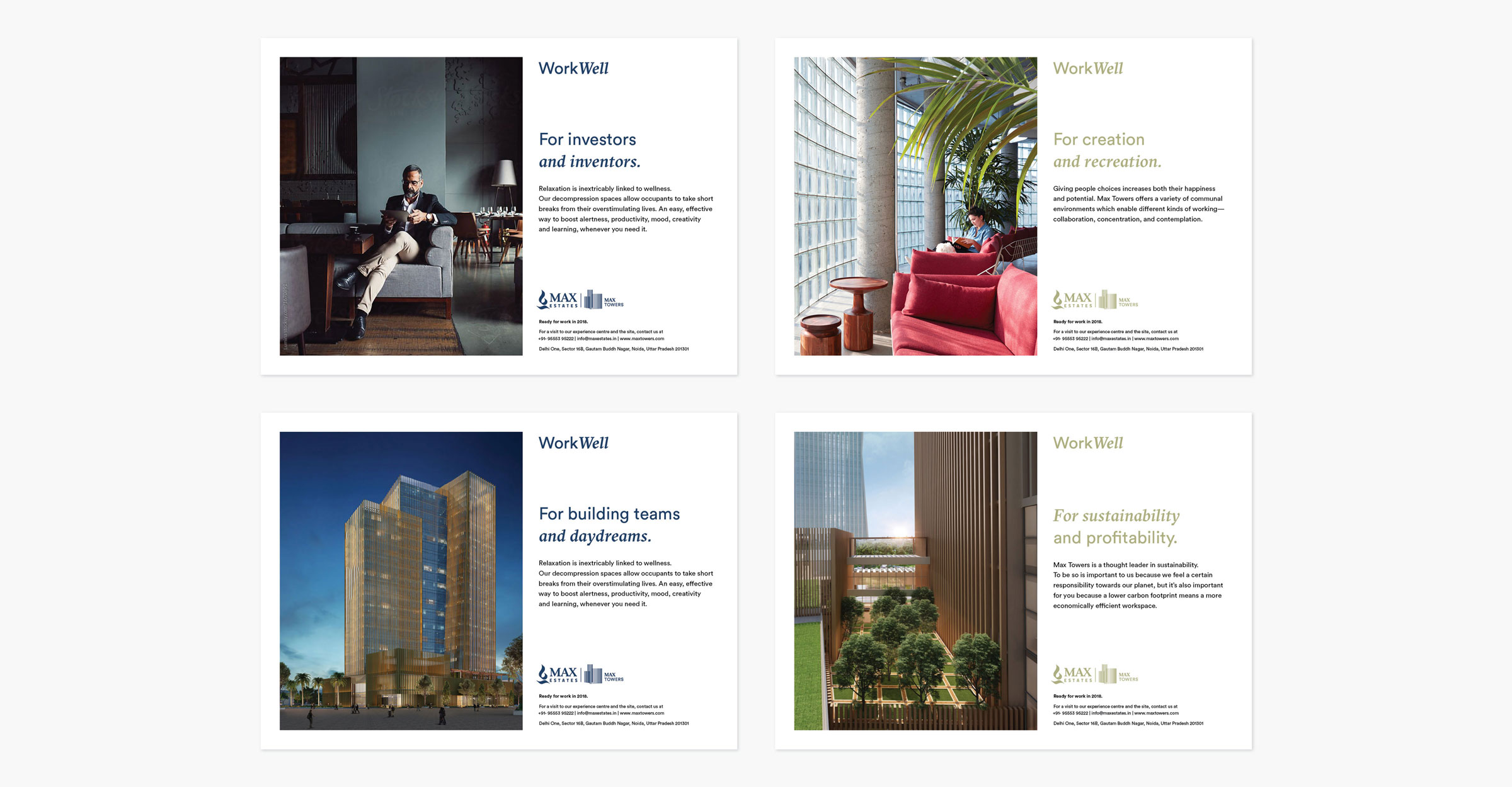
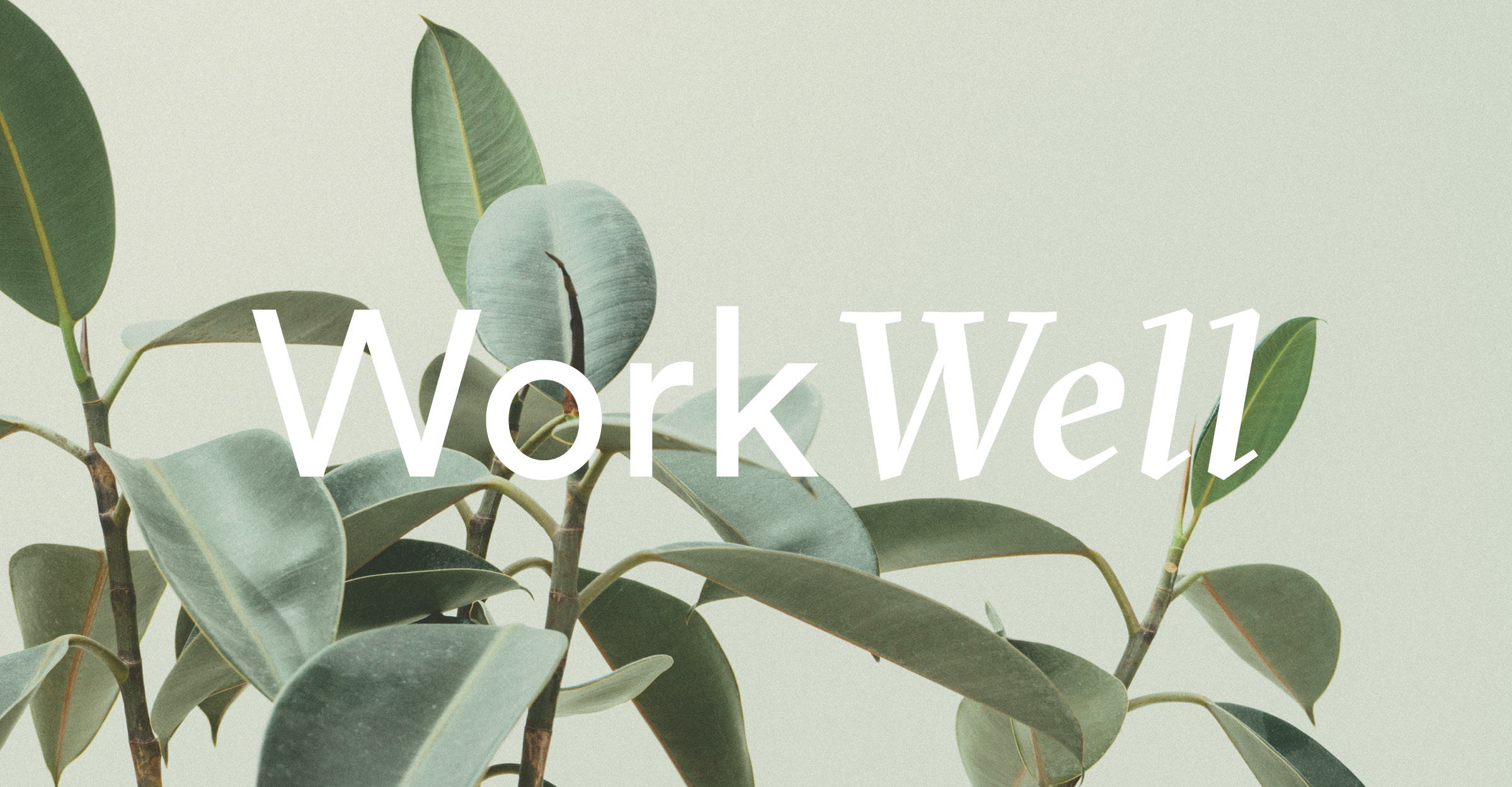
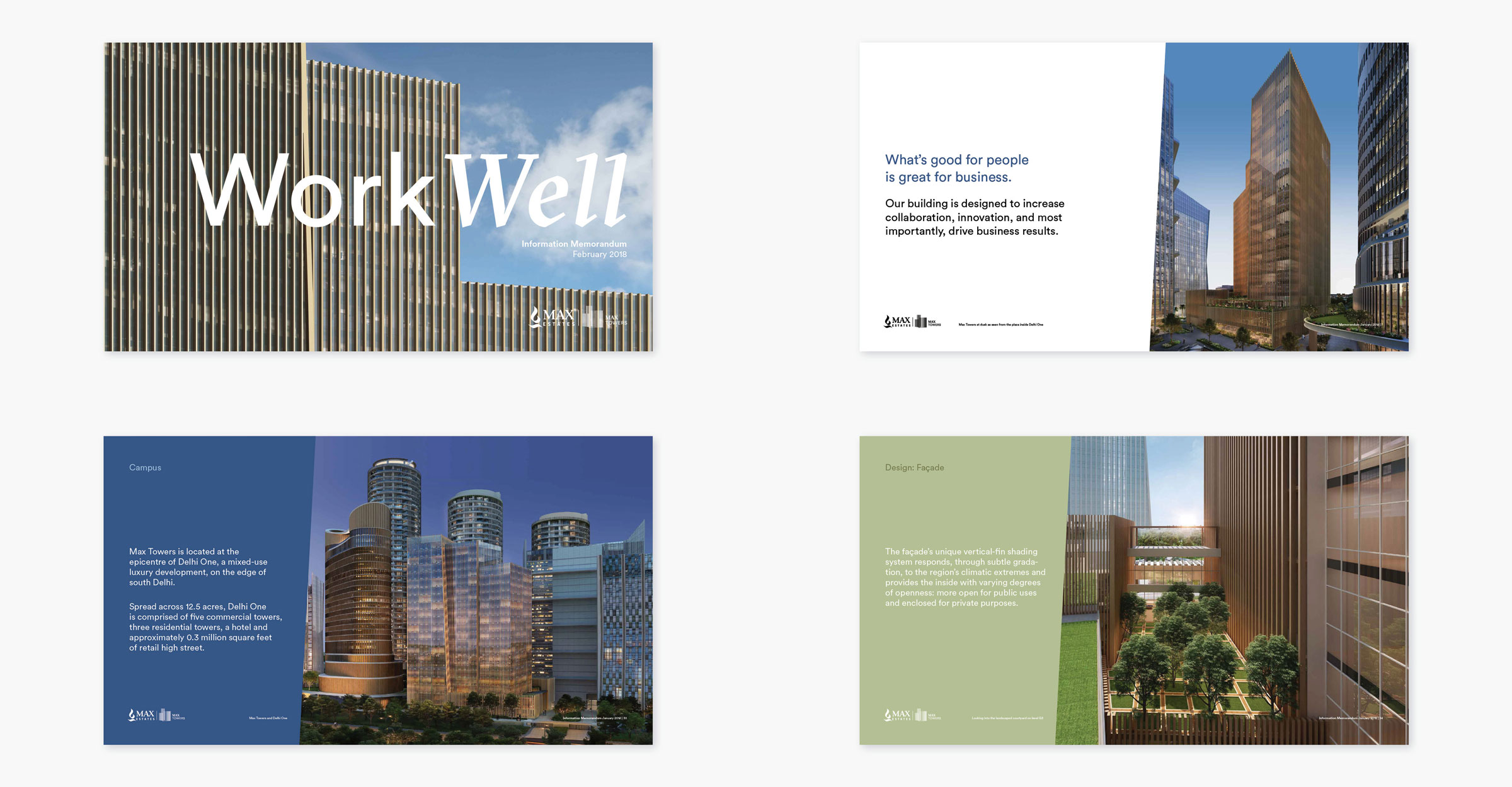
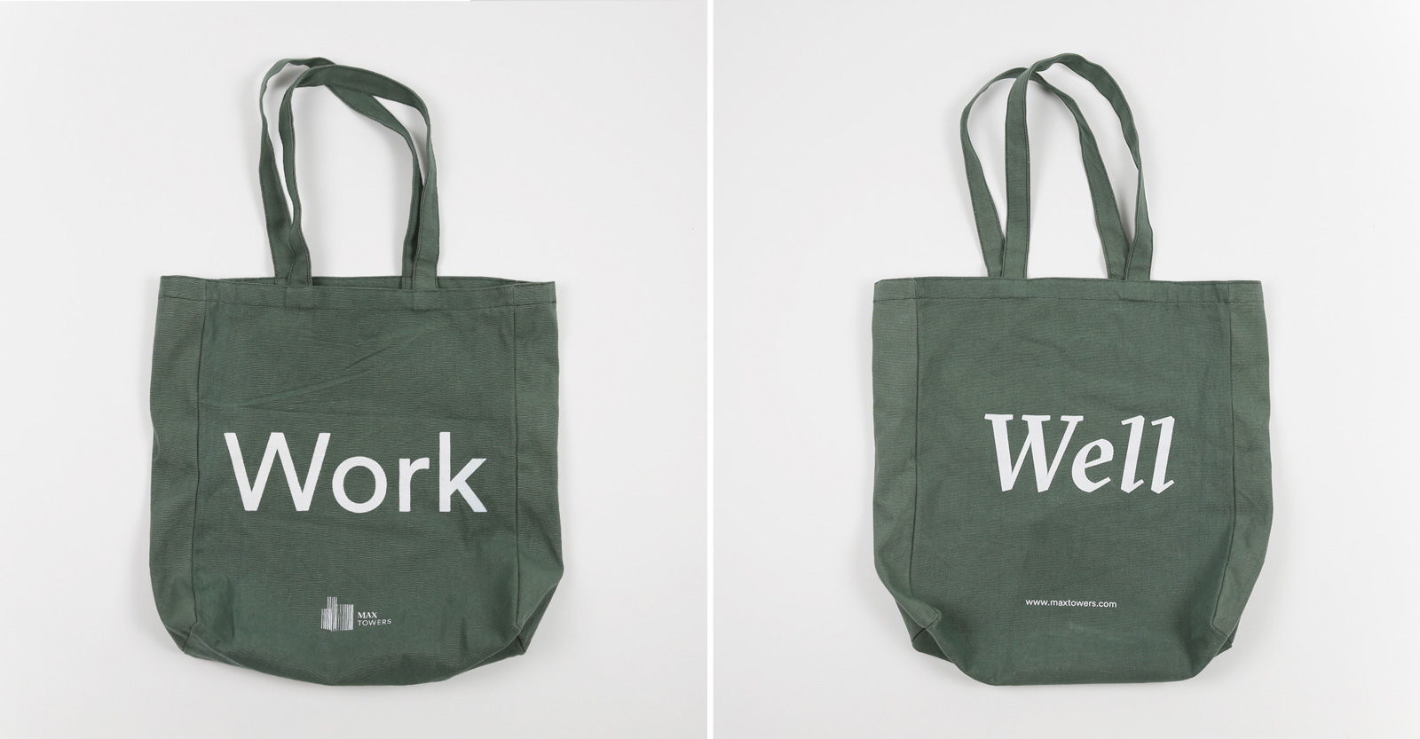
Max Towers is a LEED Platinum-certified commercial office space in Noida. We positioned Max Towers as the future of work. Our core messaging is Work Well—a brand philosophy that combines the best of a workplace with the best of wellbeing to enable happy, healthy and productive people.
We brought this idea to life through all our marketing and communications, including a brand video collaboration with Studio Moebius.
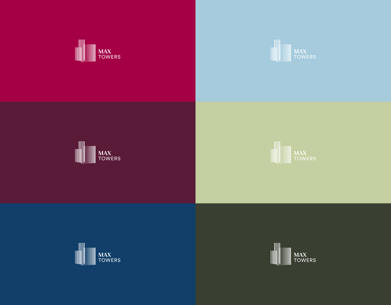
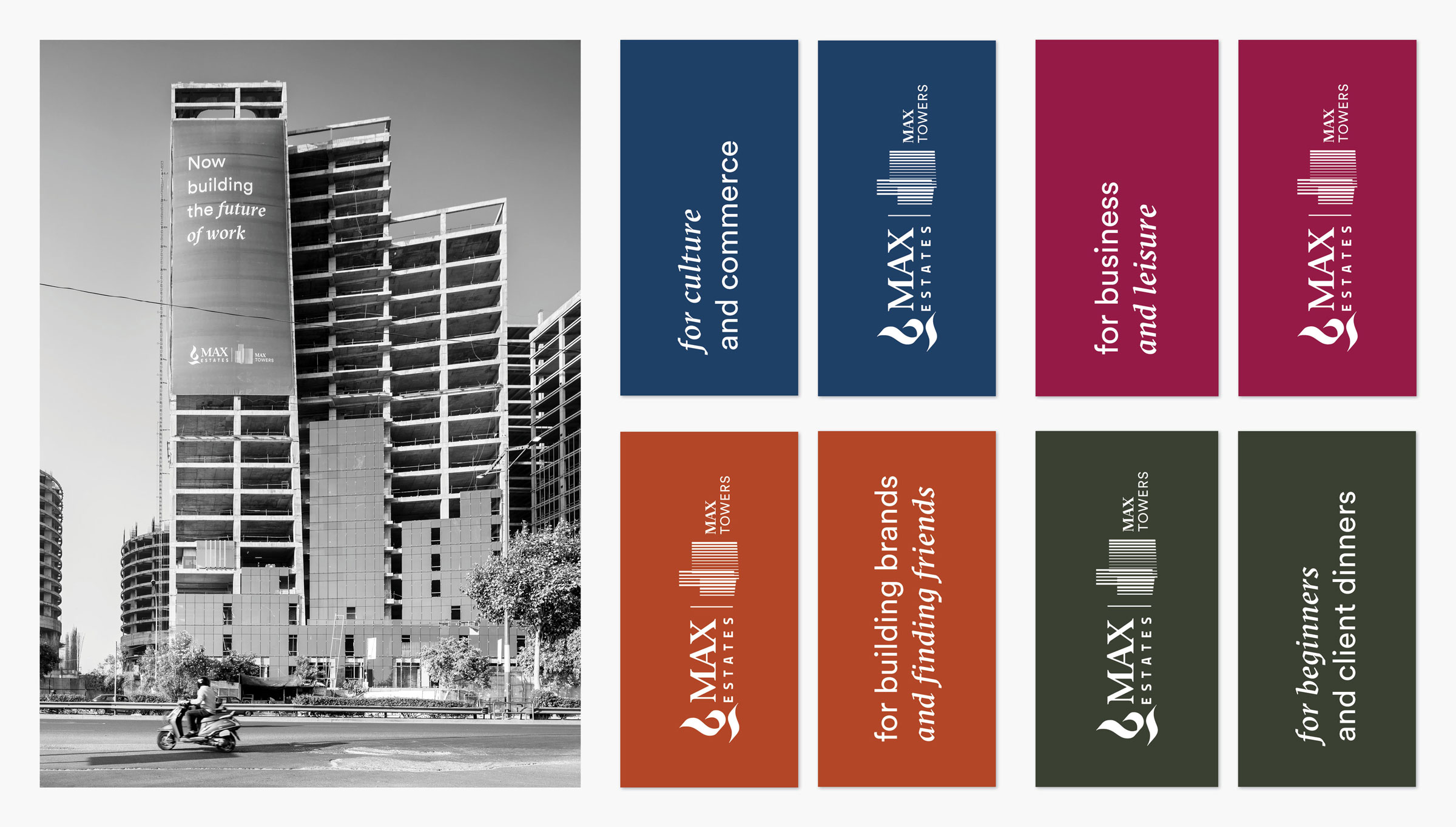
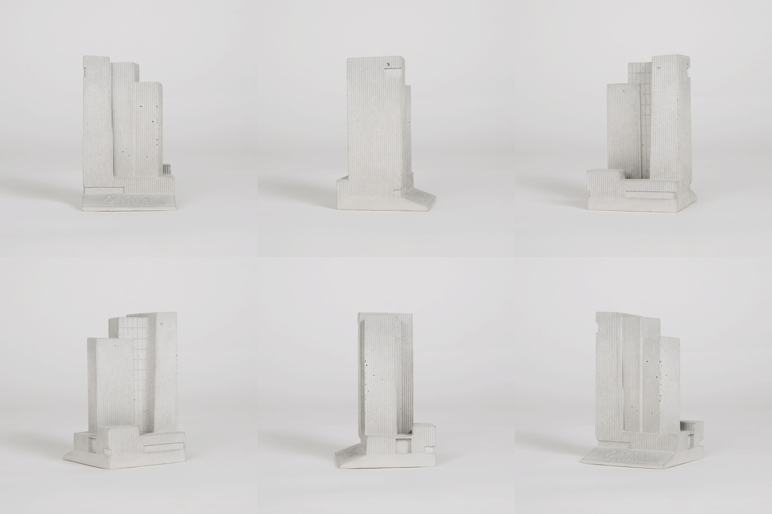
The identity and visual language of Max Towers is based on an abstraction of the shape of the building and its fins which allow for natural light which in turn allows people to work better. The colors chosen are sophisticated, yet upbeat.
We use two typefaces, one formal serif font, and one casual sans serif font, representing the balance of work and leisure offered in the building.
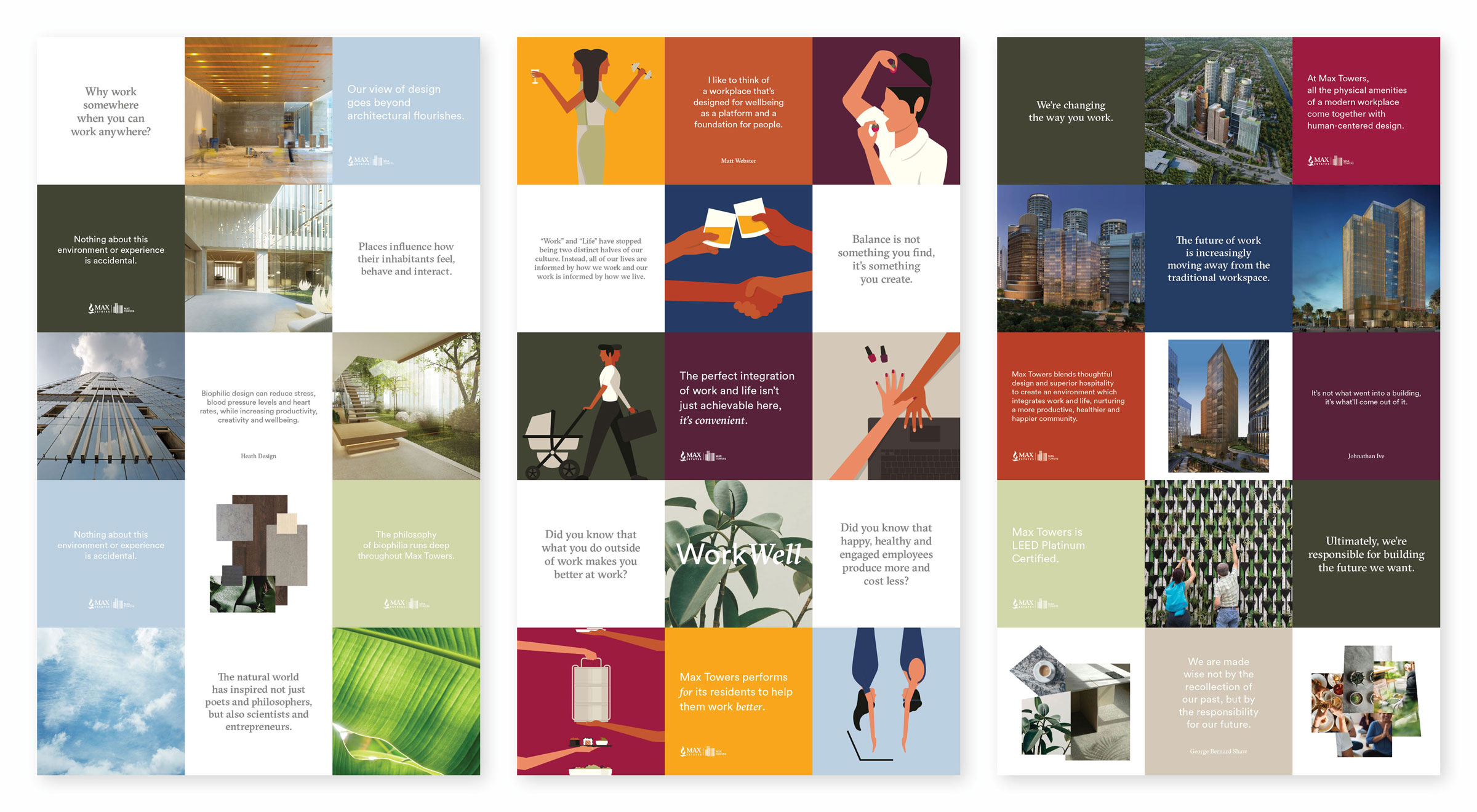
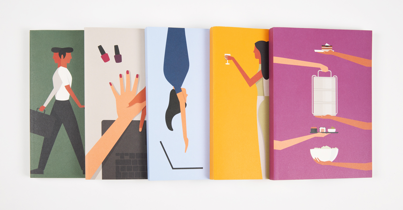
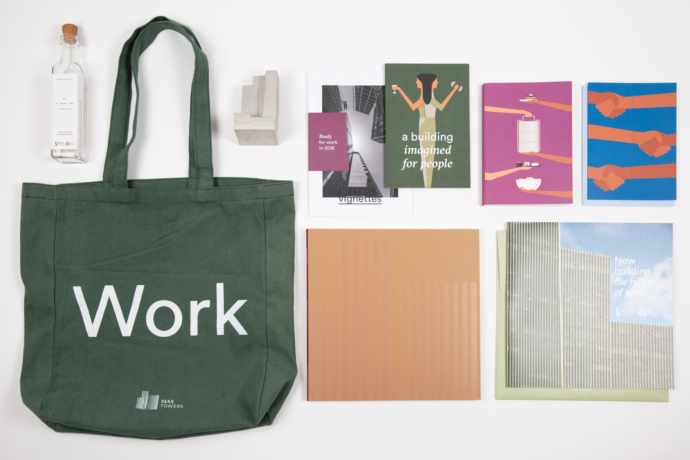
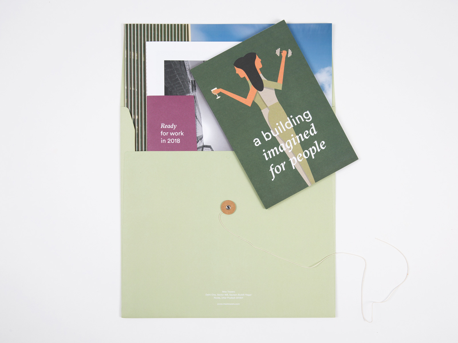
When asked to create a marketing brochure to send out to potential tenants and partners via traditional post, we proposed a series of individual booklets and handouts which captured the essence of the property. An illustrated brochure quickly communicated the key principles and features of the building, while a keepsake photo book collated construction photography by Randhir Singh and Suryan & Dang.
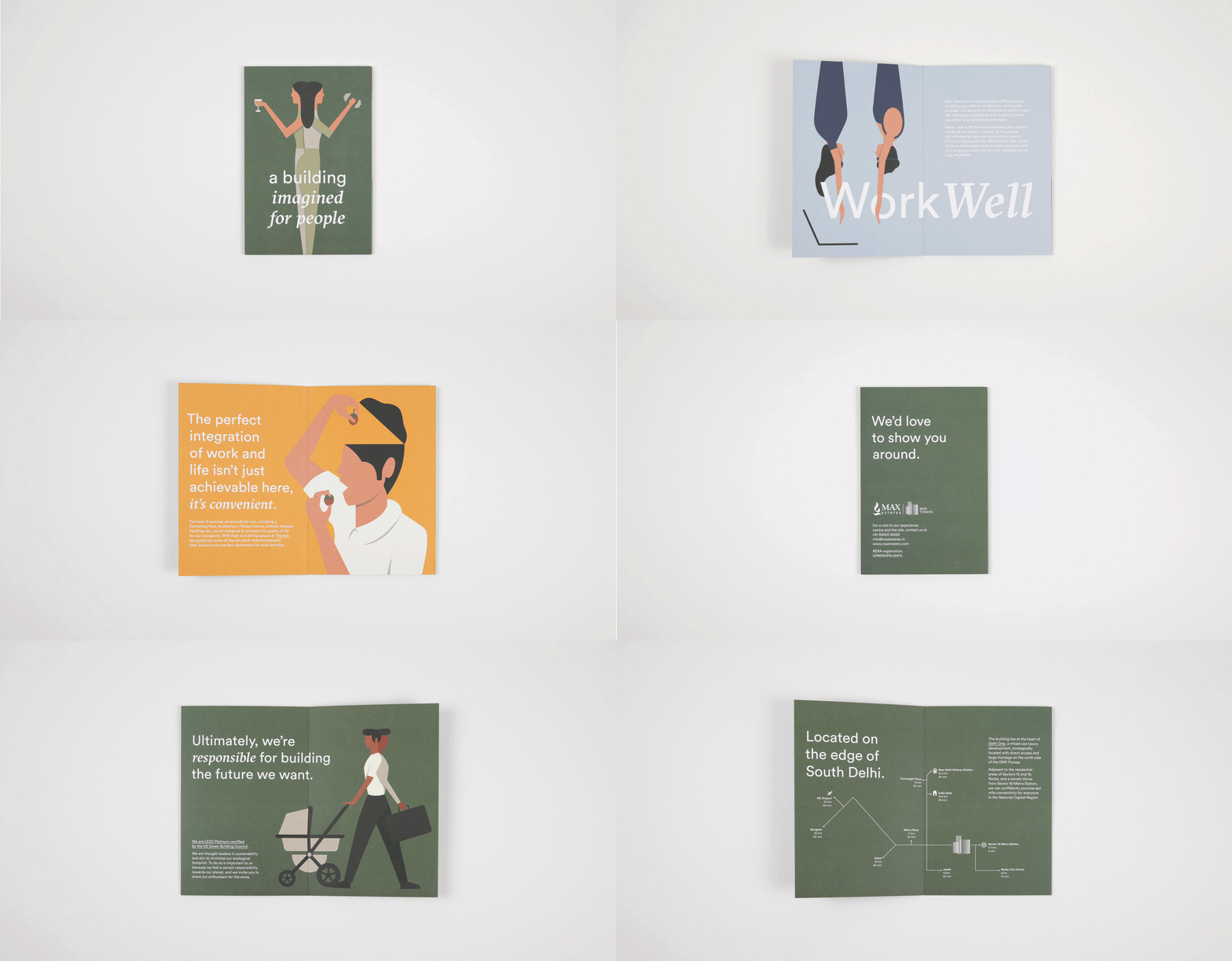
In contrast to a typical real-estate brochure, we proposed a coffee-table book that became a manifesto for the brand, reinforcing our commitment to sustainability, biophilia and wellbeing.

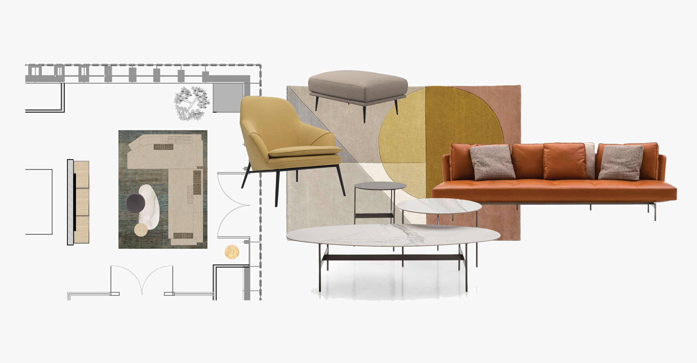
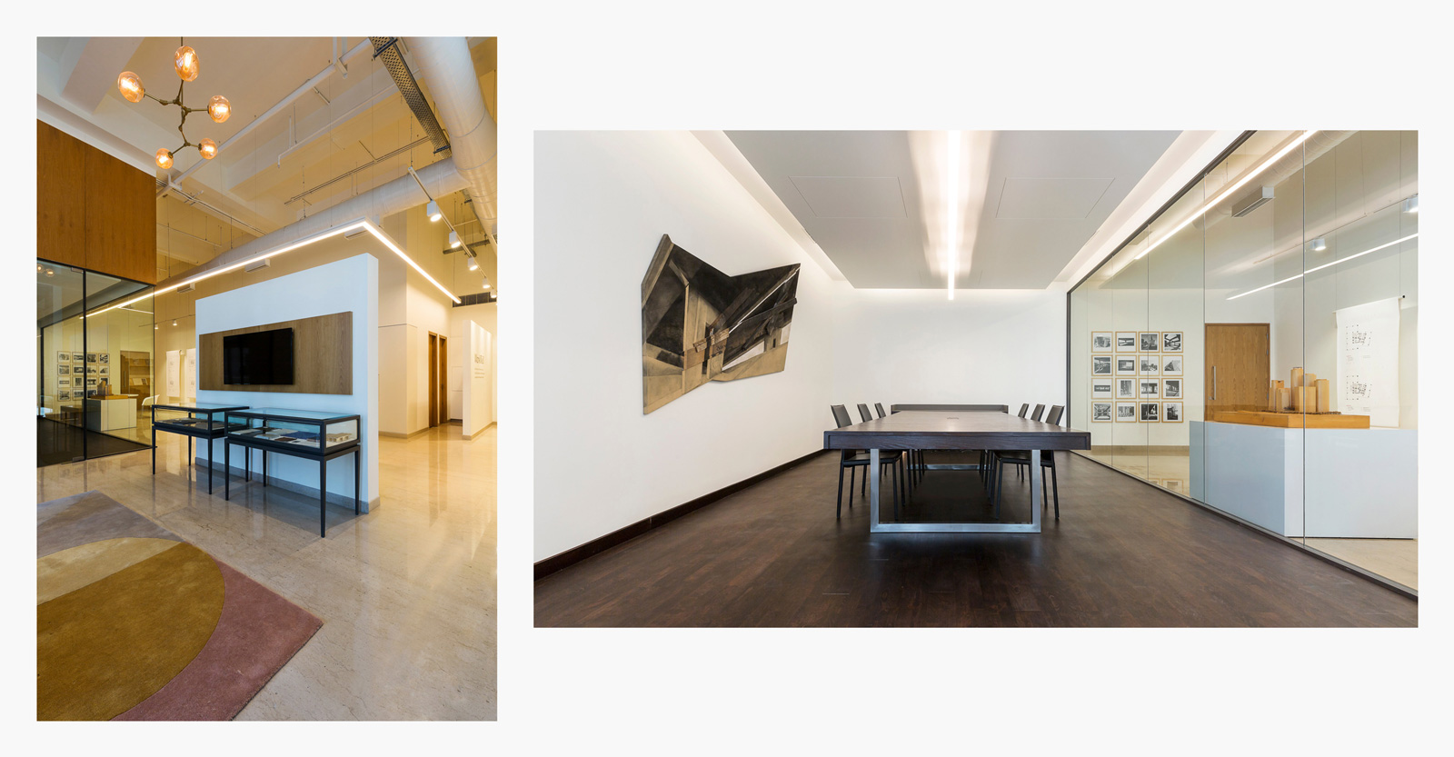
Experience Center
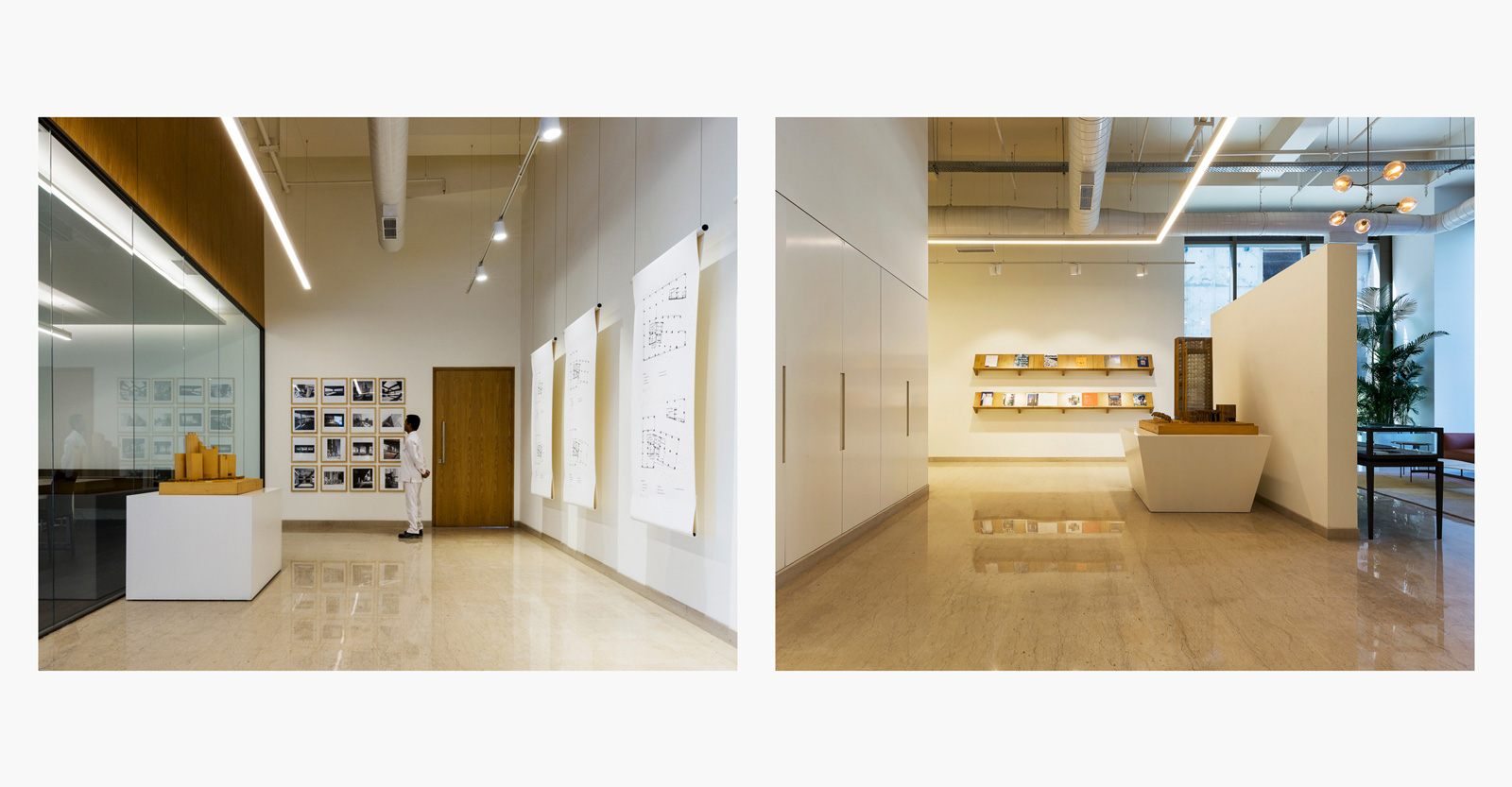
We worked with Max Towers’ interior architects to create the look and feel of the building’s experience centre—this included curating the furniture, furnishings, lighting, art and other installations.
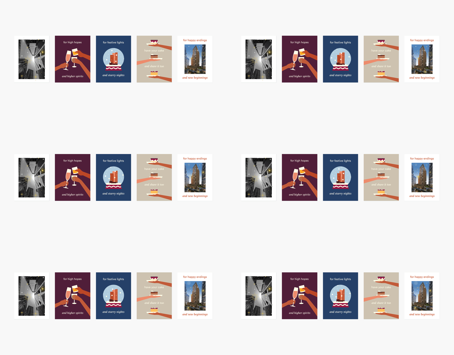
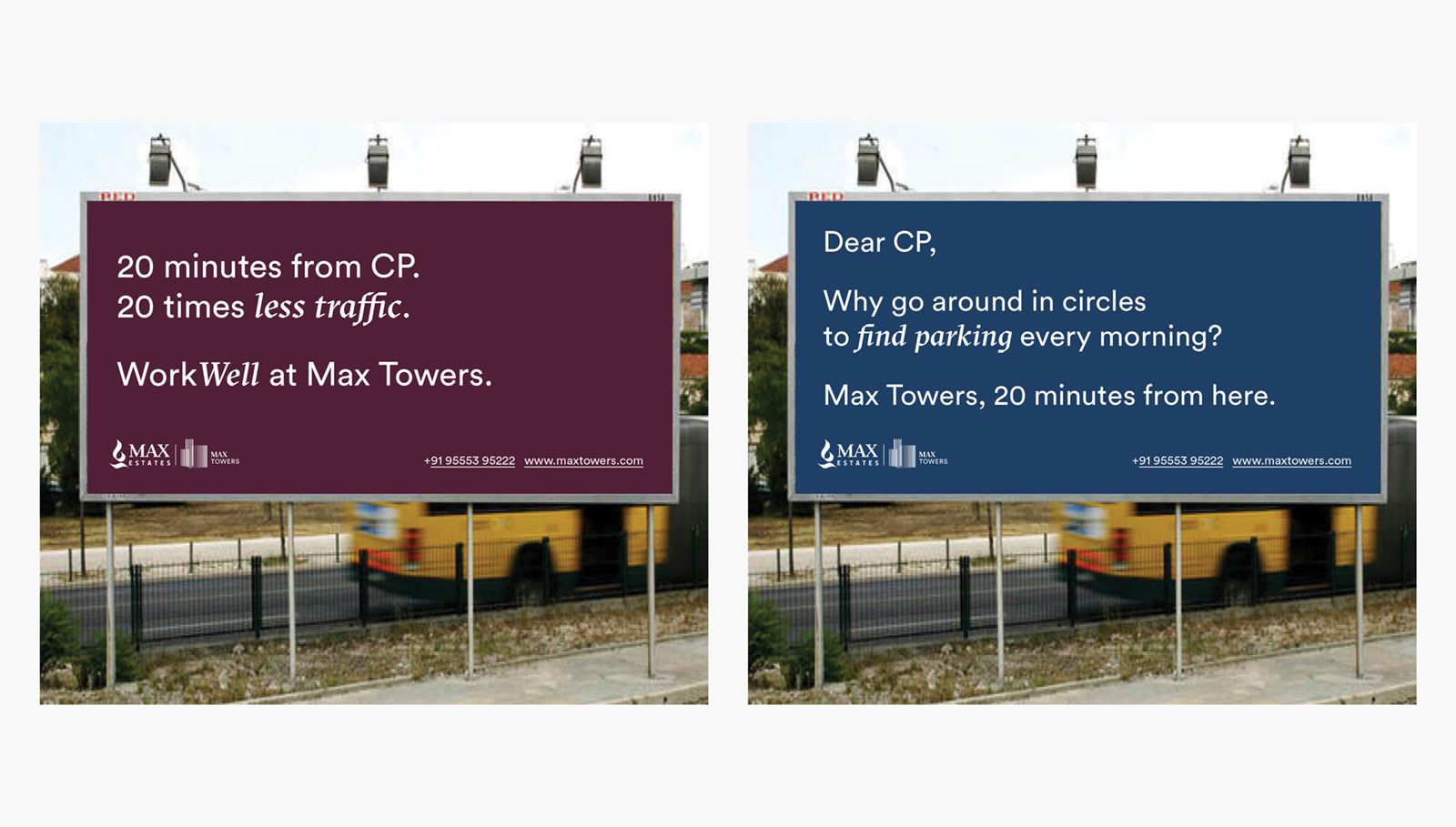
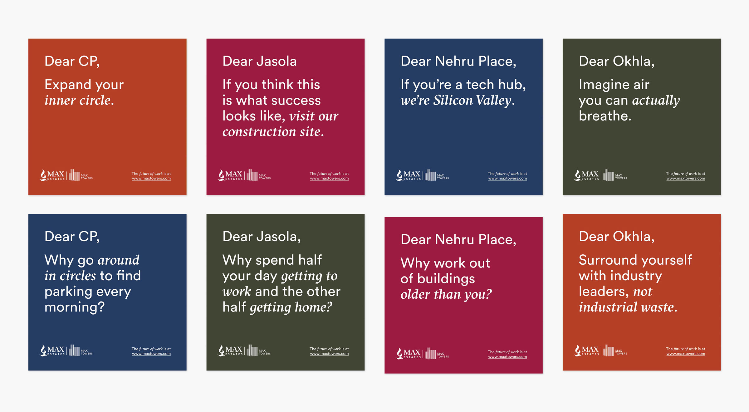
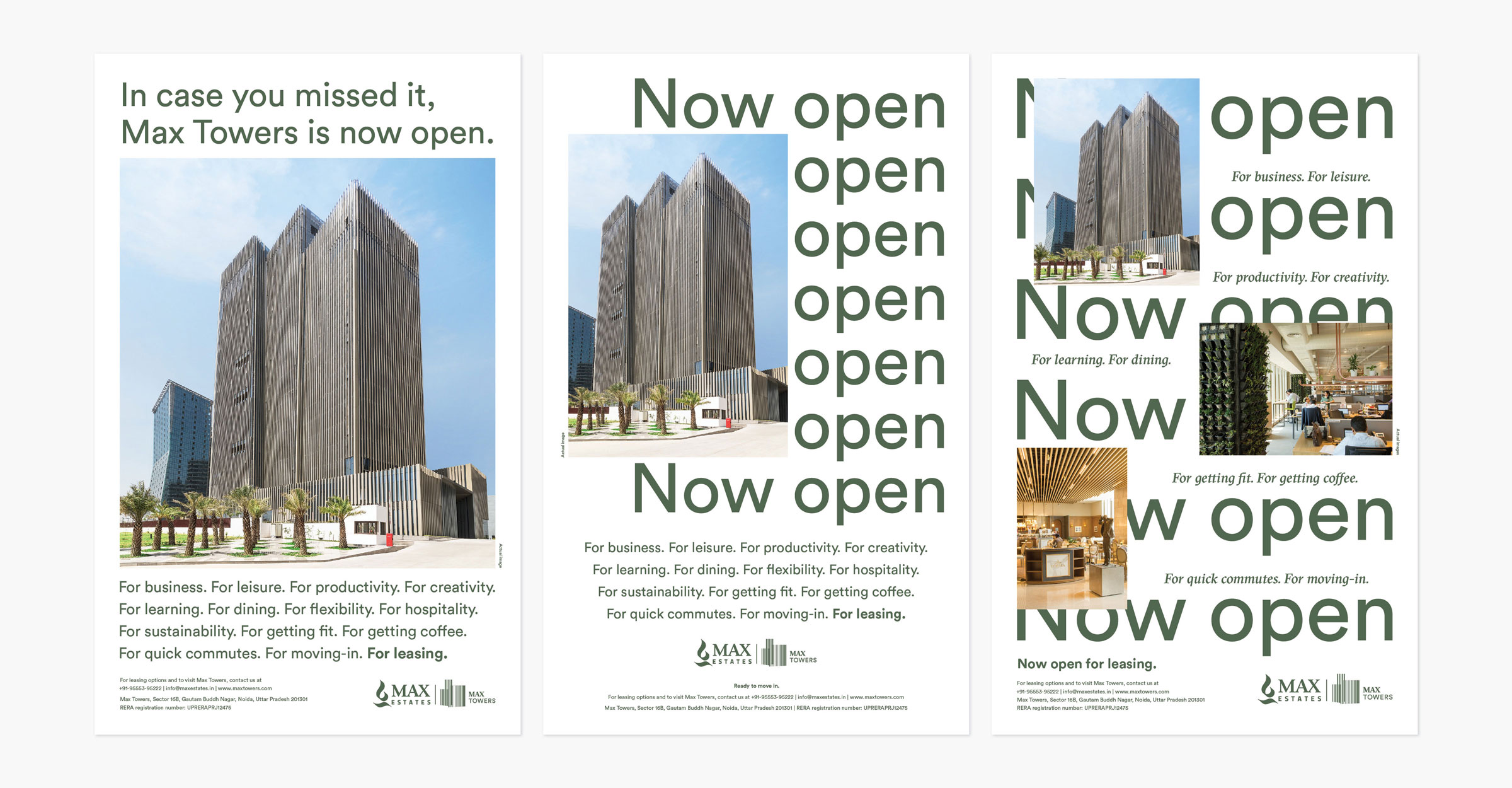
Our launch campaign relied on bold, witty copywriting and a minimal, character-driven set of illustrations to bridge the apparent duality between ‘work’ and ‘wellness.’ Future campaigns also employed an irreverent, witty tone to position Max Towers as a challenger to traditional office spaces.
Launch event
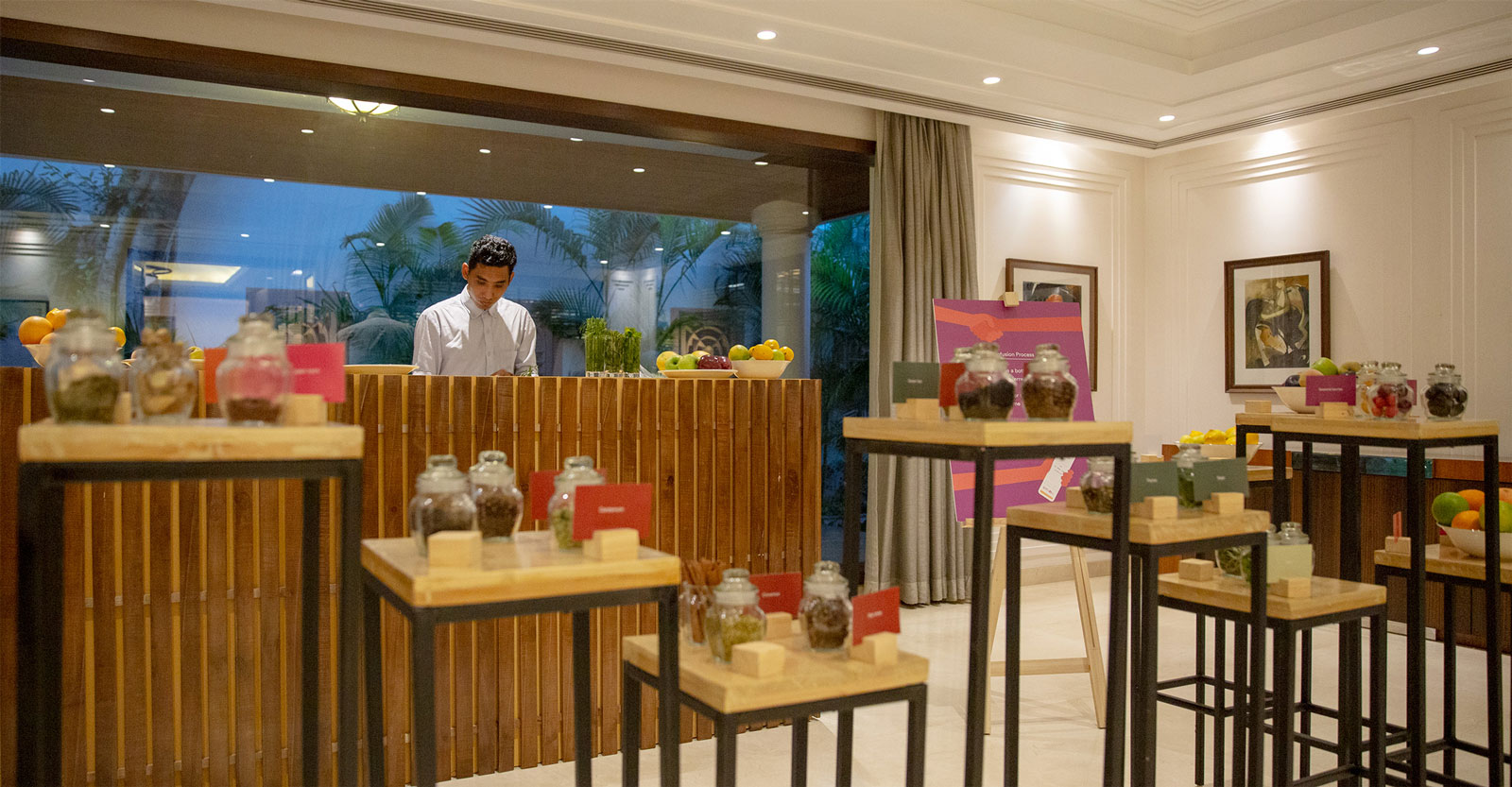
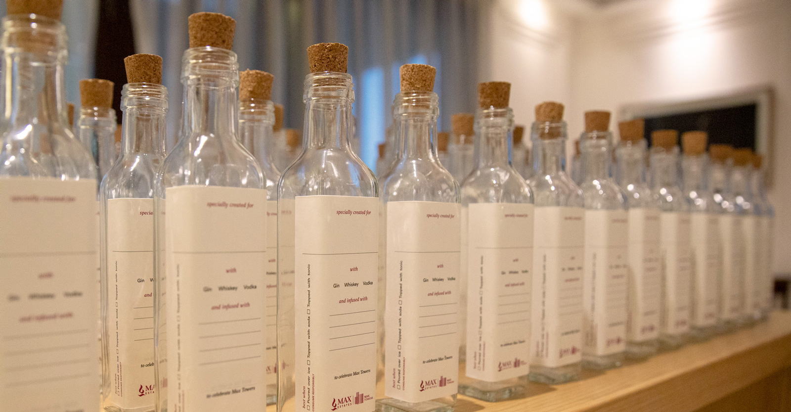
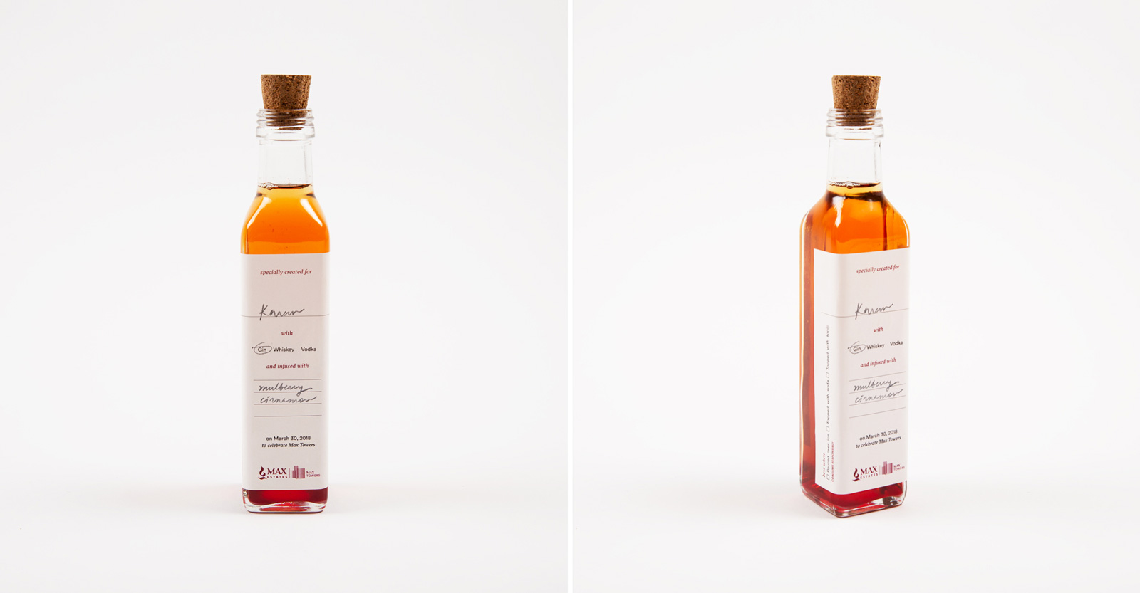
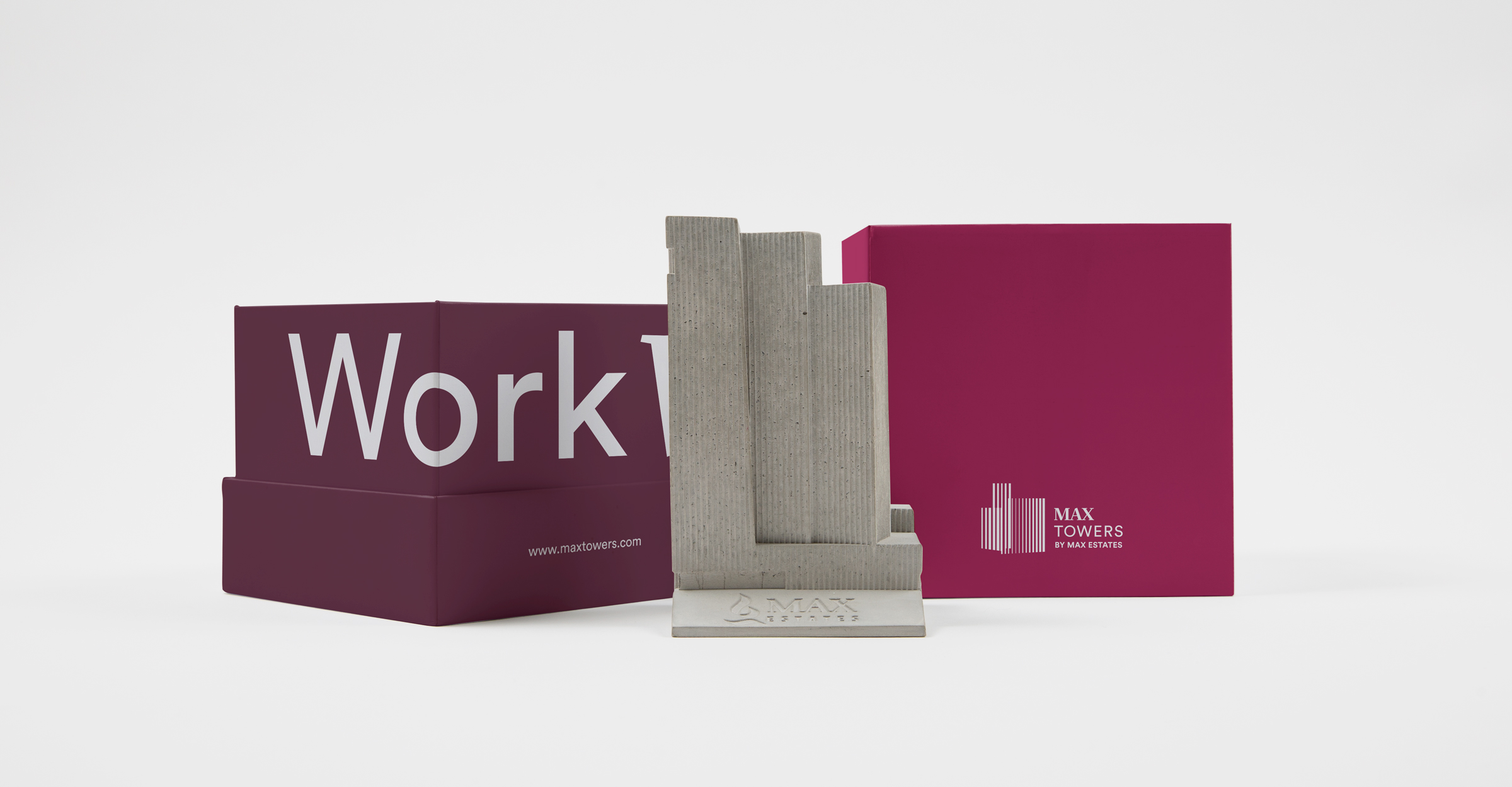
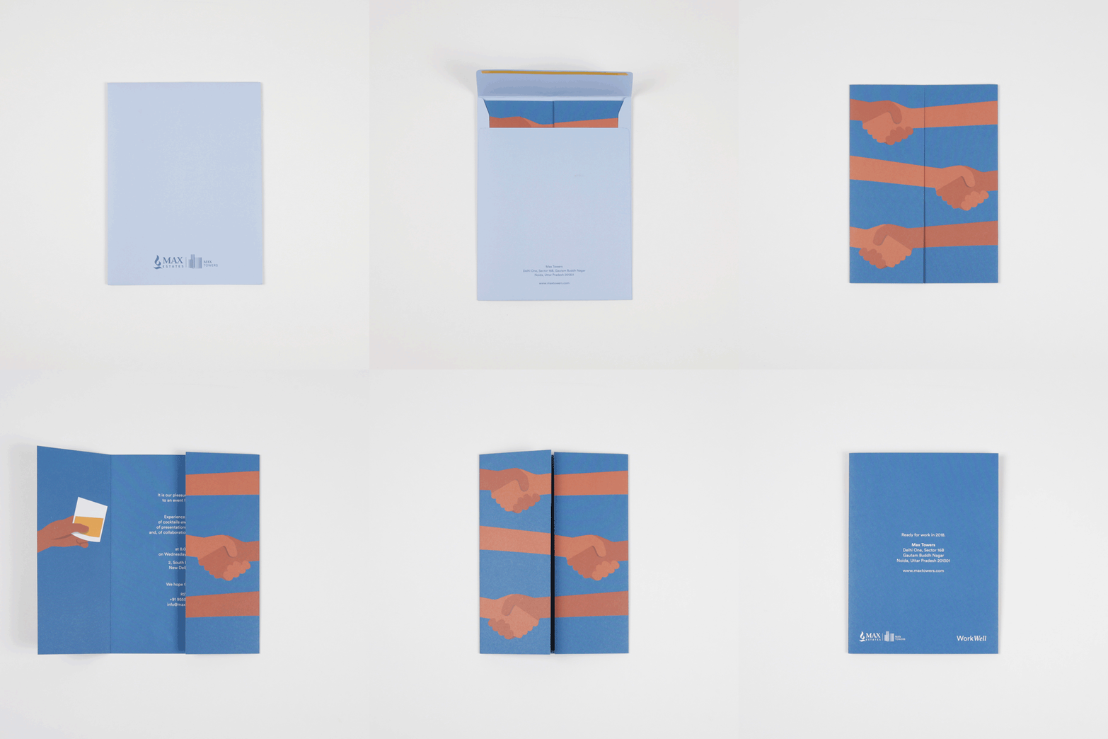
To first introduce the building to the real estate community, we curated an immersive evening with a mixology workshop, a stand-up comedy sketch, and a curated menu with unusual food combinations. We also collaborated with Material Immaterial Studio to produce a concrete paperweight in the form of Max Towers, a unique giveaway for the guests.
Wayfinding
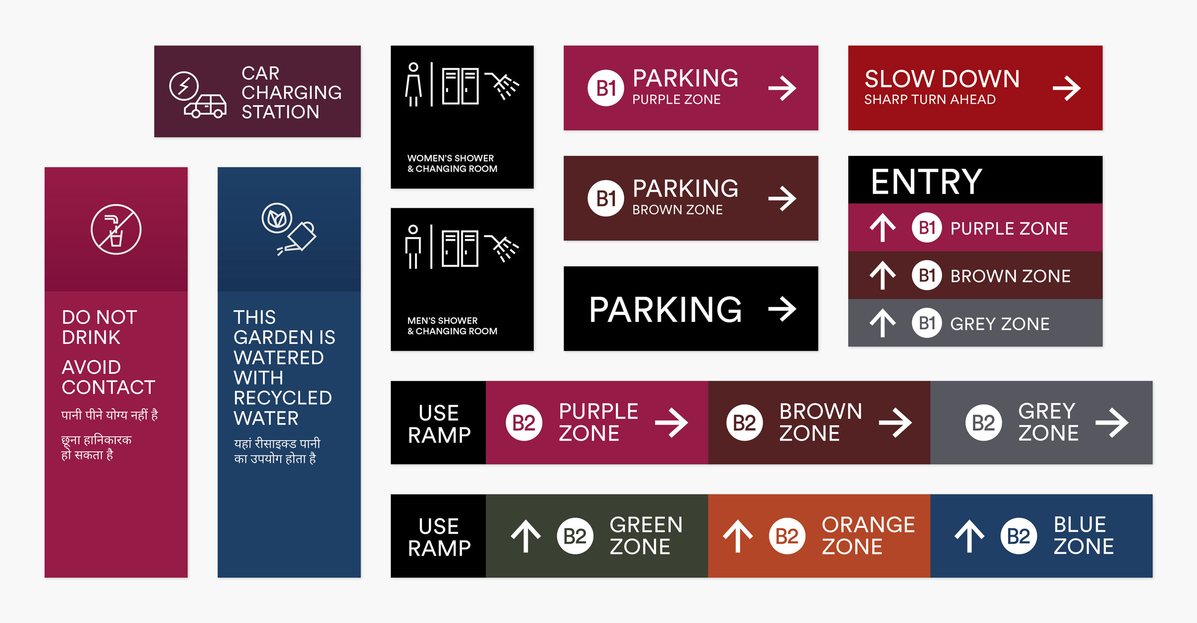
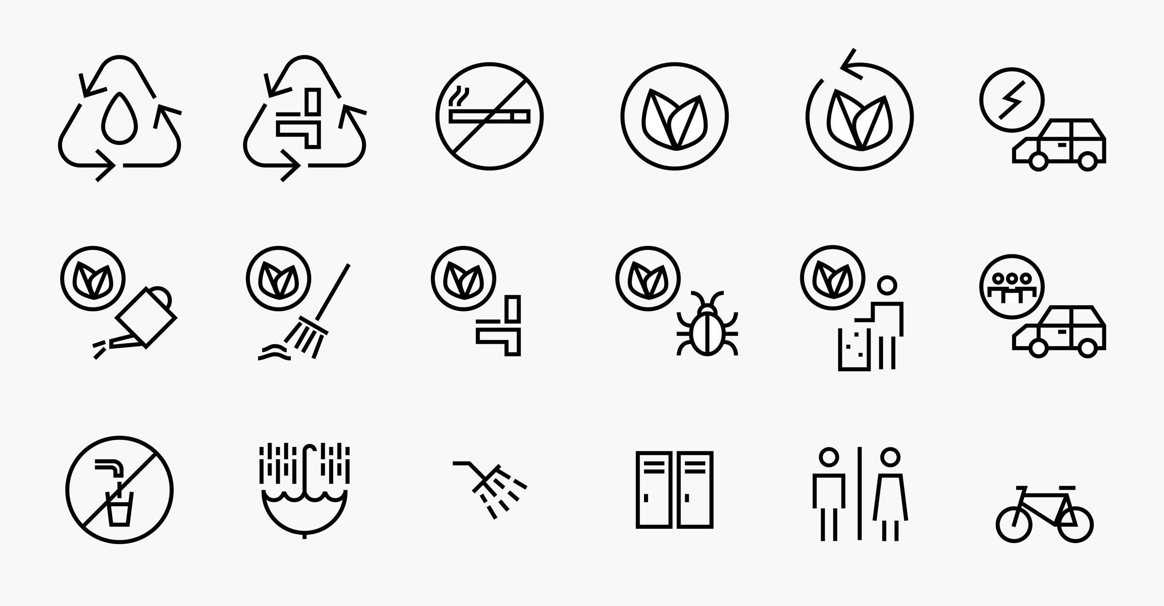
We designed the wayfinding system in the building and car park as well as all the LEED certification signage.
Digital
The website is an introduction to Max Towers, encouraging people to book a tour.
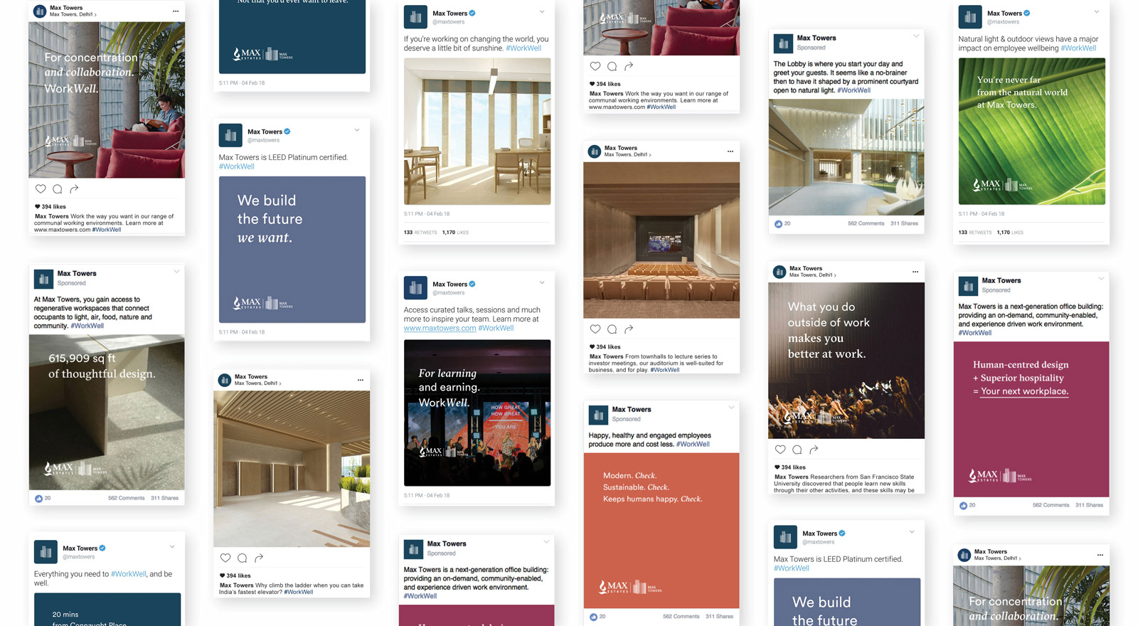
We built a social media strategy to reflect the mindset, lifestyle and programming at Max Towers.

